How to Create a Valentine Color Palette That Feels Modern

Valentine’s Day doesn’t have to be all red and pink. If you want your decorations, flat lays, or styled spaces to feel fresh and contemporary, a modern Valentine color palette is the way to go. By mixing unexpected tones, balancing bold and neutral shades, and layering textures, you can create a palette that feels romantic and stylish—perfect for Pinterest-worthy decor, DIY projects, or home styling.
In this guide, we’ll show you how to select colors, combine them thoughtfully, and apply them in ways that feel intentional and modern.
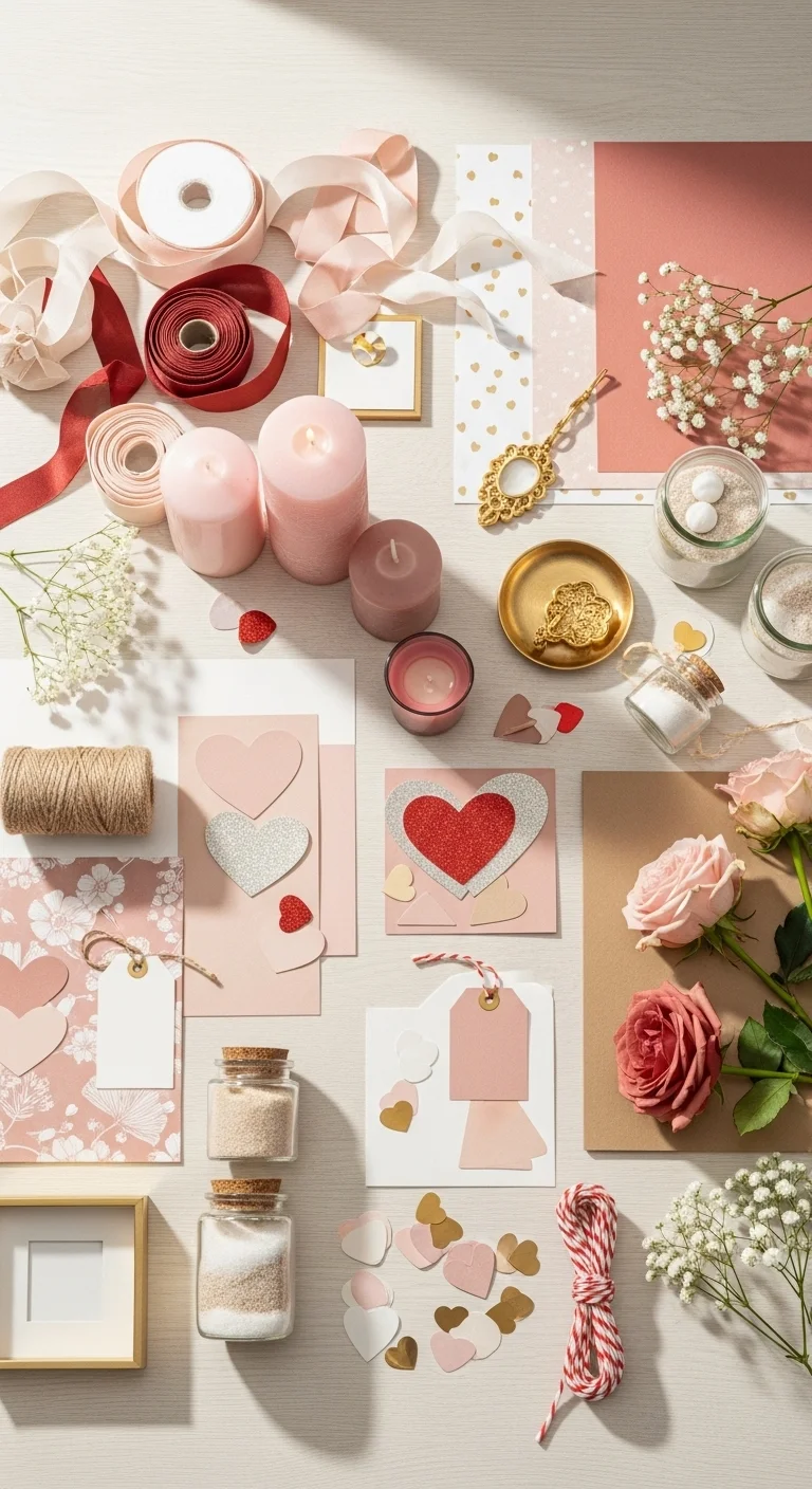
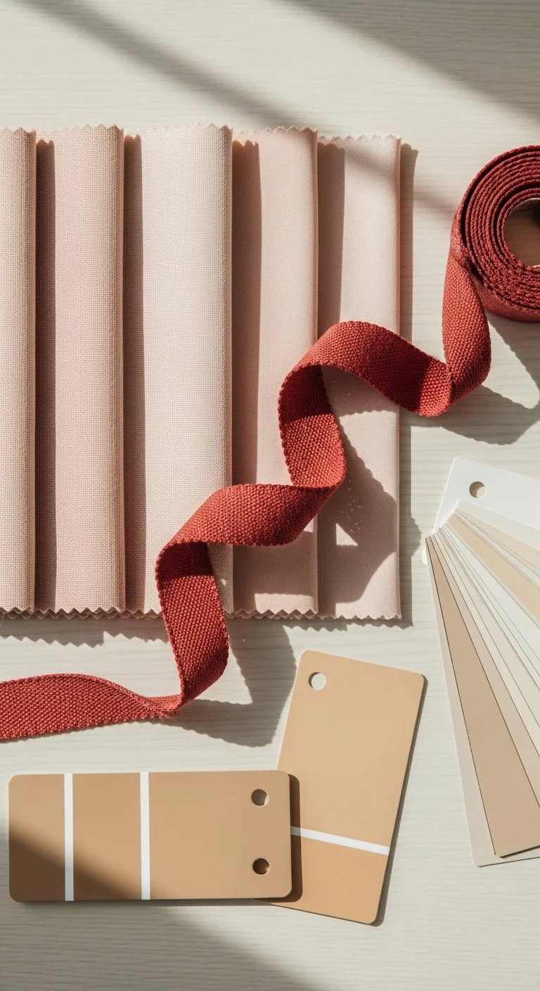
Start with a Base Color
Every great color palette begins with a strong base color. This will serve as the anchor for your palette and inform the other tones you choose.
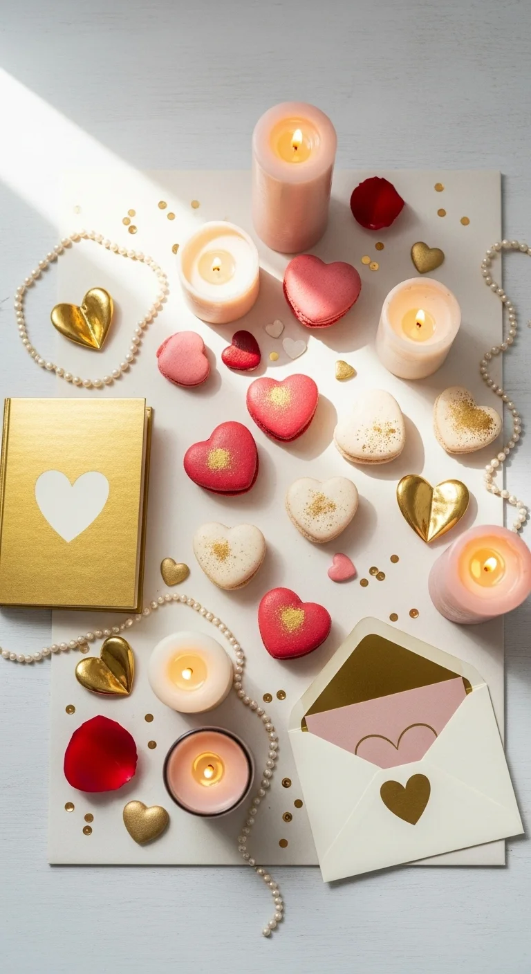
Ideas for modern Valentine bases:
- Blush pink: soft, romantic, and versatile
- Muted red or coral: bold without being overwhelming
- Warm neutrals: beige, cream, or taupe for a sophisticated backdrop
Tips:
- Choose a color that complements your space or project
- Keep it subtle if you want the palette to feel modern rather than traditional
- Use this color on larger elements like table runners, pillows, or background surfaces
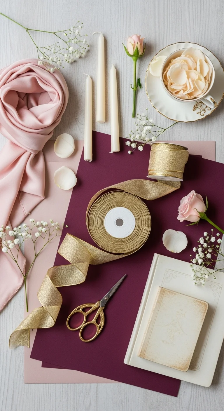
Add One or Two Accent Colors
Accent colors bring depth and interest to your palette. They can make your Valentine decor pop without being overly thematic.
Ideas for modern Valentine accents:
- Gold or rose gold: adds a chic, metallic touch
- Soft gray or warm white: balances bolder pinks or reds
- Deep burgundy or plum: adds sophistication and contrast
Tips:
- Limit accent colors to one or two to avoid a cluttered feel
- Use accents in smaller elements: candle holders, vases, ribbons, or printed patterns
- Consider the undertone of your base color when choosing accents (cool vs. warm)
Introduce a Pop of Unexpected Color
Modern palettes often include a surprising or unexpected pop of color to make the design feel fresh.
Ideas:
- Terracotta or muted orange: complements reds and pinks beautifully
- Sage green or eucalyptus: adds a natural, calming touch
- Dusty lavender or mauve: soft and romantic but less traditional
Tips:
- Use unexpected colors sparingly for maximum impact
- Incorporate them in props, small accent items, or florals
- Make sure the pop color harmonizes with your base and accent tones
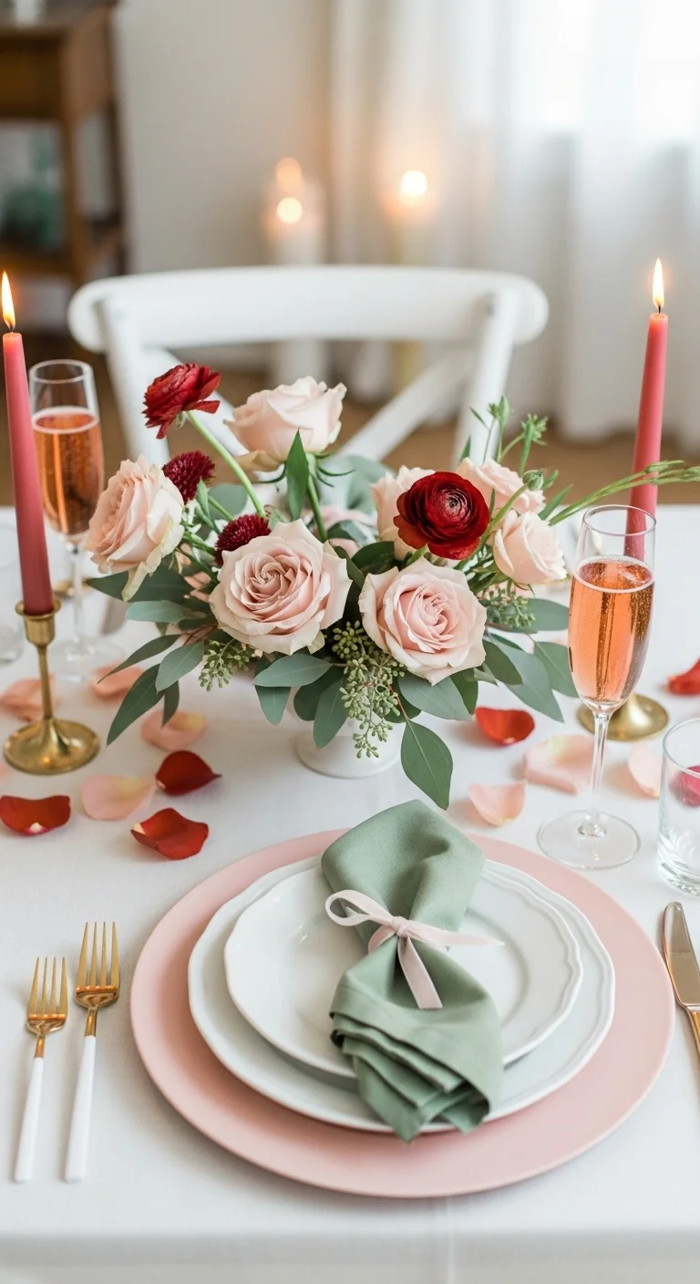
Balance Light and Dark Shades
A modern palette isn’t just about colors—it’s about contrast and layering. Mixing light and dark shades creates depth and makes your palette feel dynamic.
Tips:
- Pair soft blush or cream with darker burgundy or chocolate tones
- Include mid-tones like muted reds or soft pinks to create smooth transitions
- Balance light and dark elements in decor items, textiles, and props
Pro tip: Even in small amounts, darker tones ground your palette and prevent it from feeling overly sweet or pastel-heavy.

Apply Your Palette Thoughtfully
Once you have your palette, apply it in layers for a modern, cohesive look.
Ideas for use:
- Flat lays: arrange props in color clusters with contrast between light and dark elements
- Home decor: combine textiles, candles, vases, and small decorative items in your chosen palette
- DIY crafts: mix base, accent, and pop colors in cards, gift wraps, or paper garlands
Tips:
- Repeat colors in different elements for cohesion
- Leave some neutral space for the eye to rest
- Don’t feel the need to include every color in every piece—distribution matters more than inclusion
Final Takeaway: Modern, Romantic, and Intentional
Creating a Valentine color palette that feels modern is all about thoughtful balance, subtle contrasts, and unexpected accents. Choose a base color, add complementary accents, introduce a pop of color, and layer light and dark tones for a polished, Pinterest-worthy palette.
Save this guide, pick your favorite shades, and start styling Valentine decor that’s romantic, contemporary, and completely shareable! 💕🎨✨